

Now that I have used Lightroom for many years, processing photos from two different camera systems (Canon EOS and Fujifilm X-series), I have realized that the most important setting in the Develop module is Profile in the Camera Calibration panel.
Profile is always the first thing that I set, as it determines the contrast and color interpretation of the photo. This is the starting point for processing the Raw file. The point you start from can greatly influence the decisions you make as you work on the file.
In order to understand why the profile setting is so important we have to go back in time to the days when all photographers used film cameras and Photoshop was merely a glint in a software engineer’s eye. With color slide film, which many professionals and hobbyists used, there was nothing you could do after the photo had been taken to alter the color treatment. You had more flexibility with color negative film, but not nearly as much as you do now with Raw files or scanned film.
Back then, color treatment was largely determined by the film stock used. Many landscape photographers, for example, used Fuji’s Velvia slide film because of its fine grain, high contrast and saturated colors. But if you were shooting portraits, the color of Velvia was totally unsuitable, so you would use a slide or color negative film that rendered color more subtly and was designed to make skin look good. The ability to match film to subject was an essential skill, and many photographers experimented with a variety of film types until they found the ones that suited the way they worked.
Early digital cameras had primitive color controls and the result was that every photo looked the same. You could adjust the colors if you looked deep enough into the menu system but it wasn’t straightforward. Then camera manufacturers started building color profiles into their cameras and software so that you could pick the most appropriate one.
Camera Profiles
Every manufacturer gives this feature a different name, listed here.
Canon: Picture Style
Nikon: Picture Control
Sony: Creative Style
Pentax: Custom Image
Olympus: Picture Mode
Sigma: Color Mode
Fujifilm: Film Simulation
The Picture Styles available on a Canon EOS camera are Standard, Landscape, Portrait, Faithful, Neutral and Monochrome. Most of these are fairly self-explanatory. Most other manufacturers use variations of these names, and may have some additional options.
When you process a Raw file, Lightroom lets you select a Profile in the Calibration panel. The top profile in the menu is Adobe Standard, a profile made by Adobe specifically for your camera based on extensive testing using color charts. The idea is that the same scene photographed by different cameras will look the same once the Adobe Standard setting is applied (assuming that other color settings like White Balance are also identical).
Earlier versions of Lightroom only had Adobe Standard as a Profile choice, which perhaps explains why the Camera Calibration panel is placed at the bottom of the stack. It simply wasn’t that important as you couldn’t change the Profile (the color sliders accompanying the Profile selection are intended for advanced users).
Now all your camera’s color profiles should appear in the Profile menu, although any black and white modes may not be there. These profiles are created by Adobe to emulate the effect of selecting that color profile and using the JPEG format on your camera.
Profile and processing choices in the Lightroom Develop Module
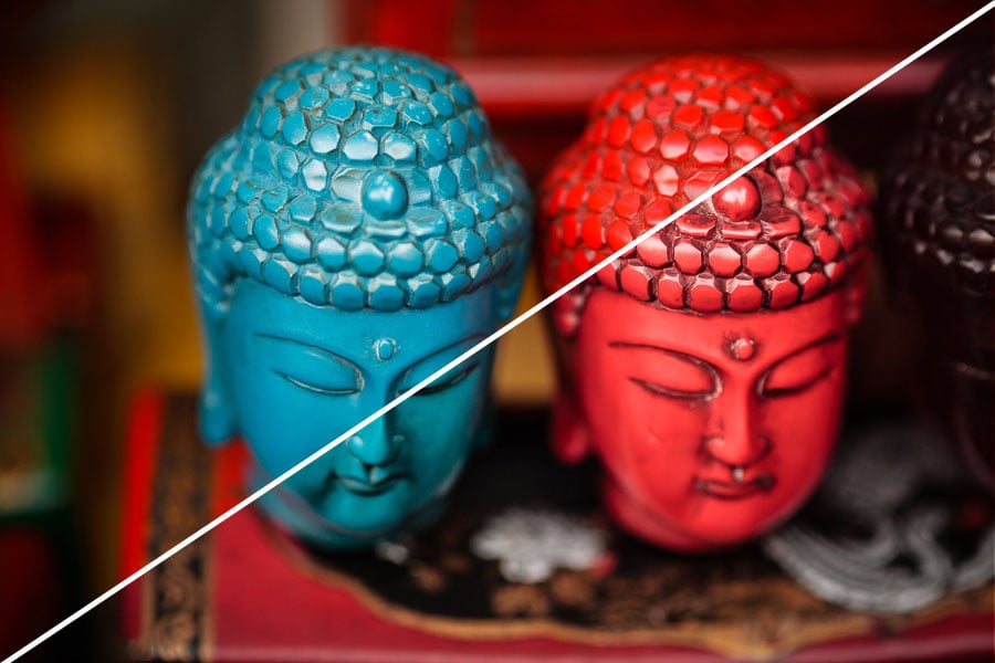
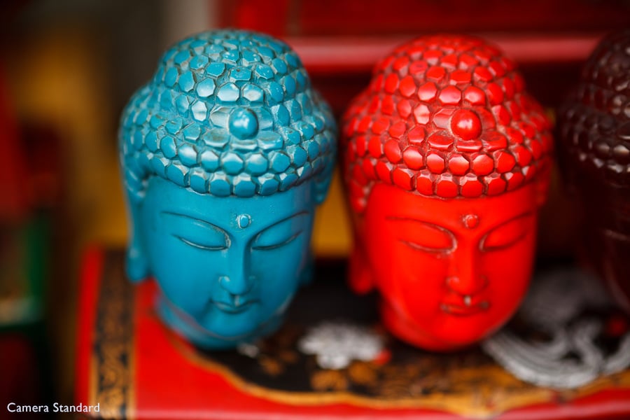
So, how much of a difference does the Profile setting make to your processing? Consider this photo, taken in China at the end of 2011. I took it with an EOS 5D Mark II, and set the Profile to Camera Standard in Lightroom. This color profile, on Canon cameras, gives saturated reds and good contrast. The result is a colorful, saturated photo.
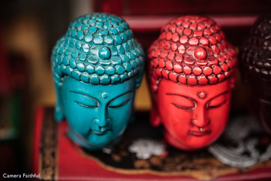
My technique has evolved since then, so I processed the photo again starting with the Camera Faithful profile. This profile is designed to render colors accurately. The red isn’t so intense, and allows the texture of the buddha head to show through. With that as my starting point I processed the photo in a different way, one that gives the photo a more natural look and brings out the textures.
One Raw file, two approaches to processing and two very different outcomes. It all started with the choice of color profile. That set the overall look of the photo – selecting a different profile the second time around sent me along a different processing path.
It’s easy to get into the habit of using one or two favorite profiles, and overlooking the possibilities of the others. This can go on for years, locking you into a certain way of processing.
Fujifilm Film Simulation
One of the things I like about Fujifilm’s Film Simulation modes (which have the same function as Canon’s Picture Styles) is that Fuji has emulated the look of various film types. The result is a more subtle approach than Canon, with each Film Simulation having its own qualities that requires a bit more thought from the photographer to match them to subject. It brings color profiles neatly around in a circle back to their origin.
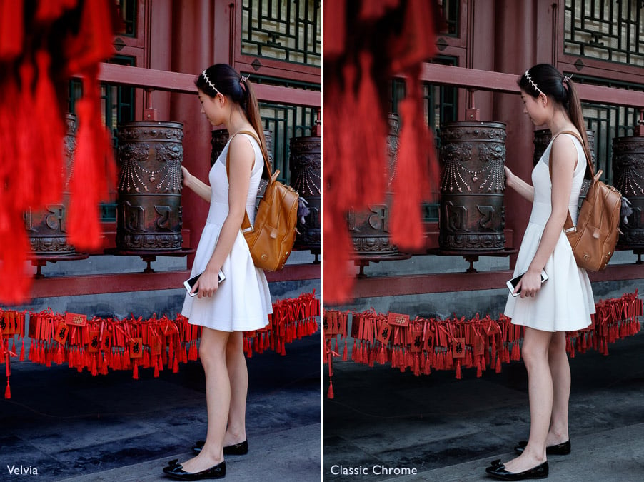
Some of these settings are seductive in their beauty. For me Velvia and Classic Chrome are the most dangerous. I set the camera to use the Velvia profile when I was in China last year, and the images look beautiful when I play them back on the camera’s LCD screen. I also applied the Velvia profile when I imported the photos into Lightroom. All this means that it is very easy to use the Velvia profile for every photo, and to not even explore the possibilities of the others.
Here are the Velvia and Classic Chrome profiles side by side. The only difference between these two photos is the choice of color profile. The Velvia profile gives strong, saturated contrast and high contrast, just like the original film, while Classic Chrome fades the color and applies less contrast in the style of older slide films.
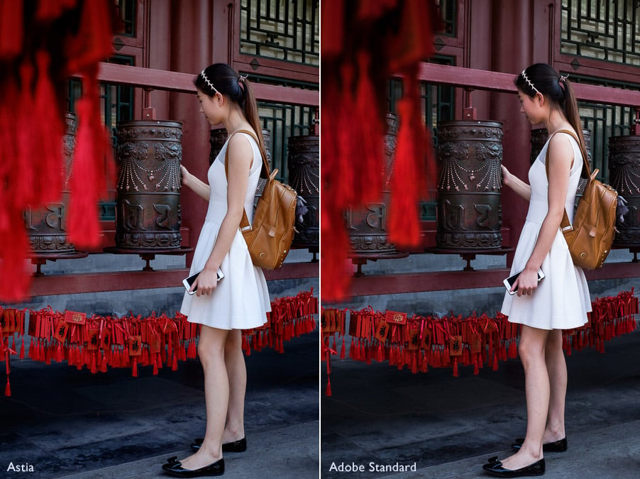
In the end I processed the photo with the Astia color profile, which gives a far more natural look. You can see it below, compared with the Adobe Standard setting (with increased Contrast as the starting point is so flat) which gives even more subdued colors.
When I look at each version individually in full screen mode in Lightroom it’s really hard for me to pick a favorite. Each has its own pleasing, though different, qualities. This shows that color profiles are evolving, and the Canon approach (Standard, Portrait, Landscape etc.) is bit of a blunt instrument by comparison.
So, remember, when you start processing a file in Lightroom, to go to the Camera Calibration panel and set the Profile first. This affects contrast as well as color, so selecting the color profile should take place before you start work in the Basic panel.
About the author: Andrew S. Gibson is a writer and photographer based in the UK. The opinions in this post are solely those of the author. You can find more of Andrew’s work on his website, or by following him on Facebook and Instagram. This article was also published here.

")
